1.

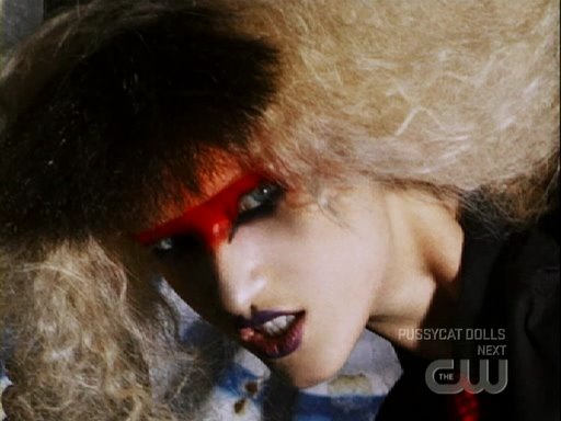
 -ANYA
-ANYAThis is a really awesome shot. I love the pose and how it makes her look tall and her body look fabulous. I think that the close up really shouldn't work but I think it does. I love her emotion here and how demonic she looks. Also, I have to give her props for having very little to work with on set but still working it.
2.

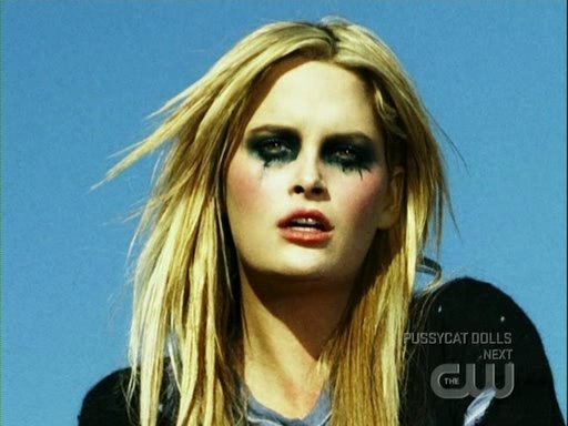
 -KATARZYNA
I think this shot is a bit overrated but I think that it's still an awesome shot. I love the cool attitude that Katarzyna has here and I love how she's just there all relaxed but still makes the shot a stand out. And basically the same thing as Anya, I definitely give her props for working it even though she had very little to work with.
3.

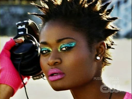
 -WHITNEY
I think as a photo, it's really an awesome shot. I love the relaxed pose and I think that Whitney's face looks really beautiful here and she definitely takes the makeup well. The problem is that for me this looks like an album cover rather than a fashion shot. I still think it's a great shot though.
4.

![[Fatima6.5.jpg]](http://1.bp.blogspot.com/_r_LaunRLuMY/SCuWEeeK6OI/AAAAAAAAFqQ/G-N3VB7fMck/s1600/Fatima6.5.jpg) -FATIMA
-FATIMAThis shot is pretty good. I mean first of all, Fatima's skin is seriously a dream here. Love. She also looks very long and lean. I think that the face looks good as well but overall I just prefer the three above her.
5.

![[Dominique6.5.jpg]](http://2.bp.blogspot.com/_r_LaunRLuMY/SCuZLueK6cI/AAAAAAAAFsA/QQbOIAl_sSQ/s1600/Dominique6.5.jpg) -DOMINIQUE
-DOMINIQUEI really like what Dominique was going for. I think she looks very beautiful here and I think that the face looks very pretty here. But I do have some problems with this shot. First, even though I think that her face looks pretty, I don't like that slight angry expression; I wish it was a bit softer. The pose I wish was a bit more relaxed because I don't think it works well at all.
6.

![[Lauren6.5.jpg]](http://4.bp.blogspot.com/_r_LaunRLuMY/SCucsOeK64I/AAAAAAAAFvg/CS0l3O6FbR4/s1600/Lauren6.5.jpg) -LAUREN
-LAURENI think that the shot itself is lovely. Everything seems perfect in this shot from the pose to the commanding face but when I go to the close up I just find this shot weaker. Her face looks pretty here but her eyes look slightly wonky and her dreadful hair. I don't really like how the shadows caught part of her face as well. So overall it's a good shot minus the face for me.
7.

 -AIMEE
Chiiiiiiiiiiiiiiild a huge no. Seriously Aimee looks like some cougar who's saying for all the boys to come here. No, no, and no. Only positive is of course, Aimee's gorgeous eyes. Would I have eliminated her here? OF COURSE NOT! Aimee got 2 FCO's from me and yeah she had two bad photos but there were people who were much worse up to this point. Girl had one of my favorite portfolios of the cycle.
8.

 -STACY ANN
So this is kind of like Lauren's photo were in the full body it looks kind of cool but the close up ruins the shot. I like the colors on Stacy Ann but I don't like how her face looks scared and I can't really see her awesome cheekbones. Overall it's a pretty photo but it has a lot of flaws.
9.

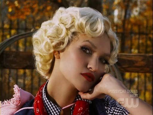
 -CLAIRE
This is just yuck. Claire looks like some short 30 year old who's going to the County Fair or something. I hate how scrunched up she looks here and I have no idea why she even thought of doing this pose since you can't really tell were her legs are.
And the call outs!
FCO: Whitney
2. Katarzyna
3. Fatima
4. Lauren
5. Anya
6. Dominique
7. Stacy Ann
Bottom 2: Claire and Aimee
Eliminated: Aimee
No comments:
Post a Comment